Try before you sign up: rebuilding Zobaze POS onboarding
Only 53% of new users got through onboarding. I moved sign-up to the end, so business owners make a real receipt for their own business first. An A/B test against the old flow showed more of them finished, and more of them stayed.
- My role
- Product + design. Sole designer; co-owned the product calls with the founder, who mentored the work.
- Scope
- Landing, sign-up, guided demo, business setup. Android.
- Scale
- 2M+ downloads, 180+ countries
- Result
- 34% → 56%day-30 retention · onboarding conversion +22% (relative) from 53%
- How measured
- A/B test: old and new onboarding ran at the same time
About Zobaze POS
A business's billing, stock and reports on one phone
Zobaze POS is a mobile point-of-sale app for small and medium businesses: retail, wholesale, restaurants, fast food, cafés and services. It covers billing, inventory, reports, staff management and an online shop front.
Its users are owners, managers and staff around the world. Many aren't comfortable with tech, and many use Android phones.
The problem
Almost half of new users dropped off before finishing onboarding
Picture a business owner who downloads the app and gives up because they can't work out how to add items or set up billing. That's a lost customer, and possibly a long-term loss.
The old onboarding had:
- A confusing landing experience with unclear steps
- A 53% conversion rate, meaning nearly half of new users dropped off
- Technical glitches, like Google sign-in redirects breaking the flow
Onboarding conversion first, then day-30 retention. Finishing setup only matters if people come back and keep billing.
Understanding the problem
Four ways of looking at the same drop-off
- Behaviour analysis: watched 100+ session recordings in Microsoft Clarity to find where users dropped off, hesitated or got confused.
- Flow teardown: went through the old onboarding screen by screen. It showed missing buttons, unclear next steps and mixed copy, which matched what the recordings showed.
- User interviews: spoke to real users about their goals and what they needed to do first.
- Competitor analysis: studied how other billing apps guide first-time users, to borrow what works and avoid common mistakes.
Onboarding teardown
Where people got stuck in the old flow
I matched each old screen with what the Clarity recordings showed happening on it.
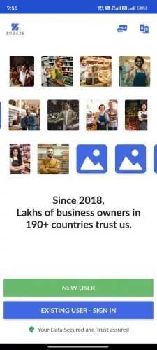
Landing screen
Most users moved ahead smoothly, but one got stuck looking for the language switch.
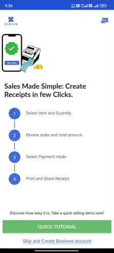
Tutorial intro
Users either followed or skipped the tutorial. Some tapped areas that weren't interactive, expecting more guidance.
"Tutorial matlab ek video jaisa hi hoga na?"
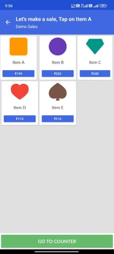
Item selection
Many didn't read the instructions and tapped everywhere. Item types and pricing confused them.
3 drop-offs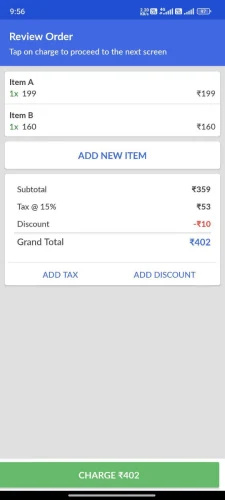
Review order
Attention went to "Add new item". Charges, the default item and the purpose of the screen confused people.
"Ye charge ka matlab kya hai yahan? Mujhe paise dene padenge kya?"2 exits
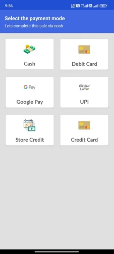
Payment mode
Users tapped UPI expecting it to work. When nothing happened, the shaking Cash button nudged them on.
No exits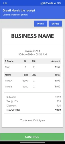
Receipt preview
Taps on Print and Share, which didn't work in the demo, frustrated users. Many thought the process wasn't over.
4 drop-offs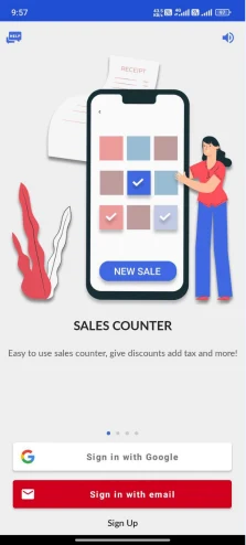
Sign up / sign in
The flow was unclear. Users switched methods, got redirected, or used emails the app didn't recognise. There was no clear path for staff login.
19 drop-offs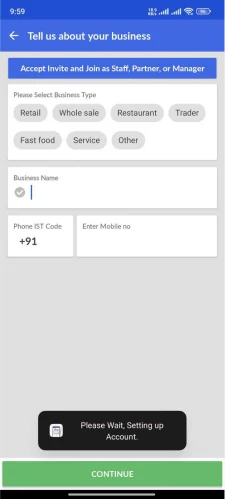
Business creation
Greyed options looked pre-filled, so users skipped the business type, then came back. The purpose of the step wasn't clear.
5 drop-offsSign-up was the biggest leak by far. People were asked to commit before they'd seen the app do anything useful.
What users told me
They came to make a receipt. Everything else could wait.
I spoke with nearly 50 business owners and staff across different industries.
Top goals
- Start billing right away. Most downloaded the app to make receipts.
- Track inventory without manual work
- See sales reports easily
- Manage staff activity
What they wanted to do first
- Set up store details and pick a business type
- Create a first receipt as fast as possible
- Add items and test stock tracking
- Print or share a sample receipt
- Check daily or monthly reports
"I searched for 'simple billing app' in the Play Store."
User interview"In other apps, billing is complicated, my staff won't use it."
User interviewCompetitor landscape
How 6 other billing apps welcome new users
I studied 6 apps popular with small businesses, noting what each did well and badly in its first-run experience.
What worked
- Minimal layouts that reduce friction
- Clear error prevention and instant feedback
- Short business setup with few details to fill
- Regional language support
What didn't
- Overloaded screens with too much information
- No guidance or tutorial on first use
- Cluttered UI and banner ads
- Unclear staff login
Keep onboarding light and step by step. Give every screen one clear action. Use familiar patterns people already trust, and cut anything that doesn't work.
Exploring flows
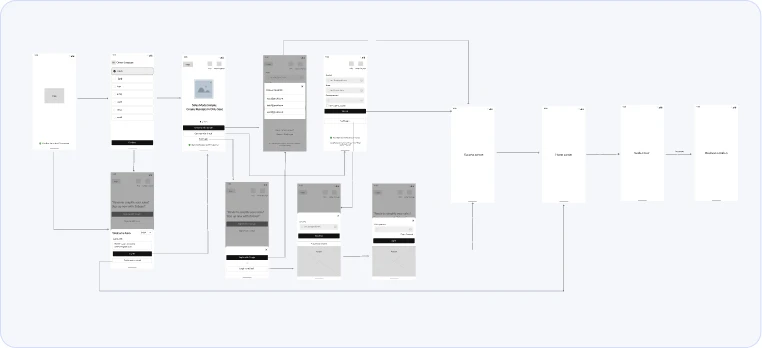
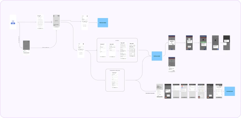
Several rounds of wireframes before the final flow
I explored several onboarding flows, tested ideas quickly and reviewed them with the founder. Each round showed more about what users needed and where they struggled.
What worked
- Both a quick setup and a guided multi-step flow
- Tried different places for the tutorial
- Language choice up front
- Full journeys mapped early
- Sign-in kept separate from staff login
- Empty states and success screens planned
What needed fixing
- Too much information up front felt overwhelming
- No progress indicator across steps
- No clear confirmation when setup was done
Sign up first, then explore
Sign-up lost 19 users in the recordings, before they'd seen any value.
Try before sign-up
Make a sample sale for your own business first. Sign-up comes last, once you've seen it work.
A tutorial to read or skip
Users expected a video, skipped it, or tapped screens that didn't respond.
A demo you do
A helper bubble walks you through a real task, one action per step.
Buttons that don't work in the demo
Dead Print and Share buttons made people think they weren't done.
Only working options, and a clear finish
A progress bar, and a reports screen that says "your business growth starts here".
Final design
A focused flow that feels fast, familiar and clear
Every screen was designed to cut hesitation and build confidence.
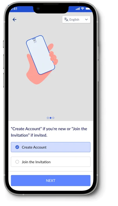
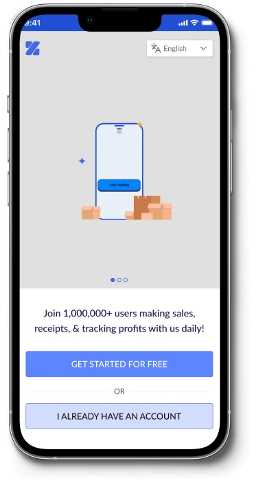
Landing screens
Short animations help users see value fast.
- Animated walkthroughs of billing, inventory and reports, the things users search for most
- Two obvious choices: new user or existing account
- Create an account or join an invitation, in plain words, with one Next button
- Progressive disclosure
- Choice reduction
- Guided decisions
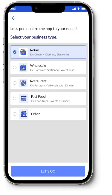
Business type
Clear choices, no guesswork.
- A clear headline, and examples under each type
- Icons for quick scanning, in a familiar radio list
- The selected option is highlighted right away
- Recognition over recall
- Low cognitive load
- Immediate feedback
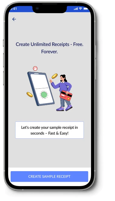
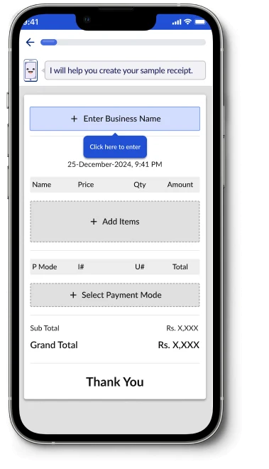
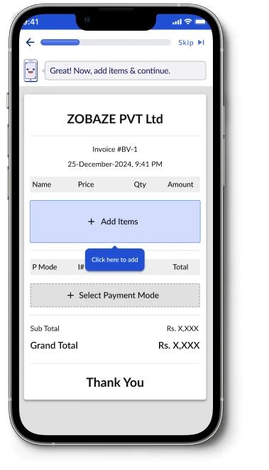
Sample receipt
Step by step, creating a receipt feels simple and stress-free.
- "Fast & easy" language lowers hesitation, and "free forever" builds trust
- A step-by-step demo with a progress bar
- "Click here" callouts point to the next action
- Positive emotion
- Affordance and guidance
- One action per step
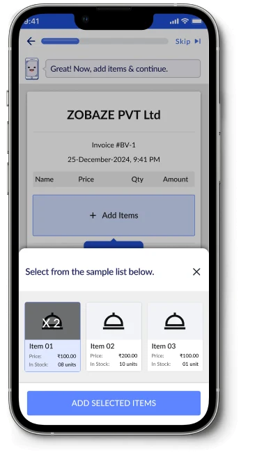
Adding items
- A friendly prompt ("Great! Now, add items & continue.") keeps users oriented
- Selected items get a checkmark and a quantity badge
- Stock left is shown, so users don't pick an out-of-stock item by mistake
- Progressive disclosure
- Error prevention
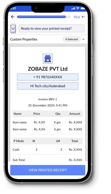
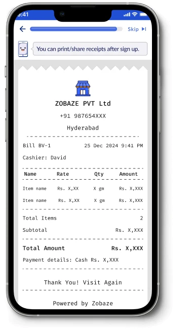
Final receipt
- Users see their own business name, with a sample phone, address and logo, which gives a sense of ownership
- A true-to-life printed receipt shows what their customers will get
- Seeing the finished receipt is the "aha" moment
- Positive reinforcement
- Match with the real world
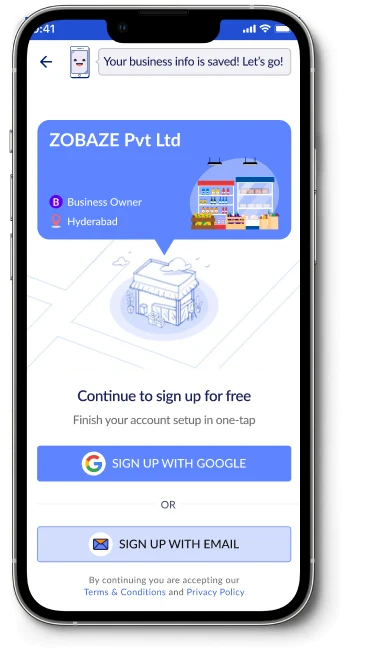
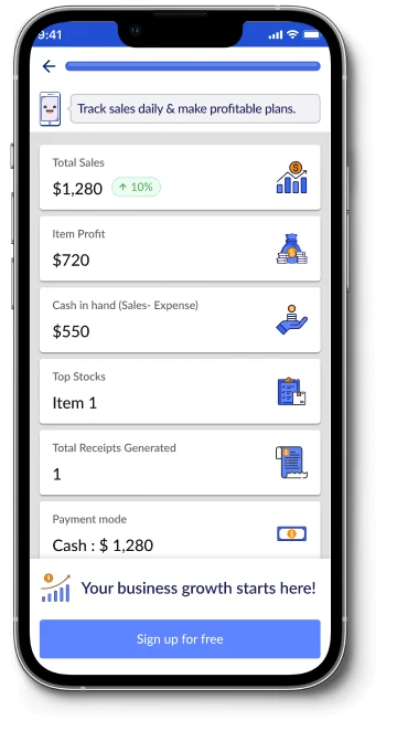
Reports and sign-up
A sneak peek of success, and account setup in one tap.
- Sample sales, profit and stock numbers help users picture their own reports
- The sign-up screen shows the business they just created, on a branded card
- Sign up with Google or email, in one step
- Encouraging microcopy
- Match with the real world
Impact
More people finished, and more of them stayed
An A/B test: the old onboarding and the new one ran at the same time, and we compared onboarding conversion and day-30 retention between the two groups.
Before → after
- Scattered steps became one guided 7-step flow
- Options that didn't work were removed
- Animations and micro-interactions made each step clearer
- Sign-up moved to the end, so users see value before committing
During the process
- Handoff included motion specs, interaction notes and edge cases
- Product, engineering and support agreed on the "try before sign-up" approach
"Clearer, faster, and more welcoming."
Internal testers, before launch"This looks good, clear, and it resonates with actual receipts."
Early user testingWhat I learned
What's obvious to me isn't obvious to a business owner
- Designing for such a mixed audience meant every step had to be clear and approachable.
- Watching real sessions challenged many of my assumptions about what's obvious and what's confusing.
- Step-by-step guidance and early wins, like seeing a sample receipt, build trust and get people to finish setup.
- Working closely with product and engineering showed me how much collaboration shapes the final experience.